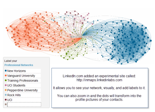
LinkedIn just came out with an experimental feature on their site this week: InMaps, which allow you to visualize your network of connections on their site. The connectivism class I'm taking is focused on networks this week, so I found it perfect timing for this feature to be released.
I started the first decade of my career with a global, franchised training company, represented in dark blue on my network map. More recently, I've spent seven years teaching in higher ed, with my full-time position at Vanguard University, represented in dark orange on the map. Considering the length of time at both of those institutions, it isn't surprising that they make such a mark on the map.
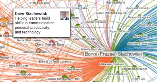
I also was amused by the large orange dot in the middle (shown below). That is Dave, my husband, who I met while we were both getting our MA at Chapman University. We went on many years later to get our doctorates at Pepperdine University, which is represented in light orange on the map. We have a lot in common and it isn't surprising that our network connections overlap to such a high degree.
Here's a video with one of LinkedIn's engineer's describing this new, highly visual tool:
Check out your network InMap and share (in the comments) what observations you have about what it conveys…


