• Skip to primary navigation
  • Skip to main content
  • Skip to footer

Teaching in Higher Ed

  • Podcast
  • Blog
  • SPEAKING
  • Media
  • Recommendations
  • About
  • Contact
BLOG POST

Visualize your network connections #CCK11

By Bonni Stachowiak | January 25, 2011 | | XFacebookLinkedInEmail

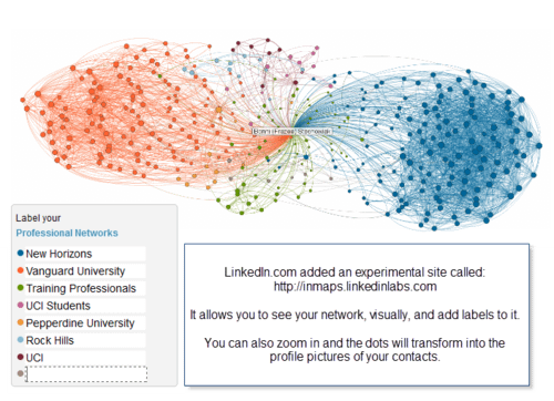
LinkedIn just came out with an experimental feature on their site this week: InMaps, which allow you to visualize your network of connections on their site. The connectivism class I'm taking is focused on networks this week, so I found it perfect timing for this feature to be released.

Network

I started the first decade of my career with a global, franchised training company, represented in dark blue on my network map. More recently, I've spent seven years teaching in higher ed, with my full-time position at Vanguard University, represented in dark orange on the map. Considering the length of time at both of those institutions, it isn't surprising that they make such a mark on the map.

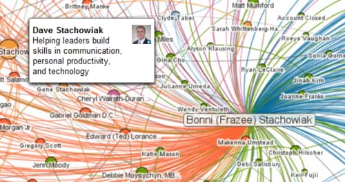
I also was amused by the large orange dot in the middle (shown below). That is Dave, my husband, who I met while we were both getting our MA at Chapman University. We went on many years later to get our doctorates at Pepperdine University, which is represented in light orange on the map. We have a lot in common and it isn't surprising that our network connections overlap to such a high degree.

Dave

Here's a video with one of LinkedIn's engineer's describing this new, highly visual tool:

Check out your network InMap and share (in the comments) what observations you have about what it conveys…
Filed Under: Personal knowledge mastery Tagged With: #CCK11

Bonni Stachowiak

Bonni Stachowiak is the producer and host of the Teaching in Higher Ed podcast, which has been airing weekly since June of 2014. Bonni is the Dean of Teaching and Learning at Vanguard University of Southern California. She’s also a full Professor of Business and Management. She’s been teaching in-person, blended, and online courses throughout her entire career in higher education. Bonni and her husband, Dave, are parents to two curious kids, who regularly shape their perspectives on teaching and learning.

Woman sits at a desk, holding a sign that reads: "Show up for the work."

GET CONNECTED

JOIN OVER 4,000 EDUCATORS

Subscribe to the weekly email update and receive the most recent episode's show notes, as well as some other bonus resources.

Please enter your name.
Please enter a valid email address.
JOIN
Something went wrong. Please check your entries and try again.

Related Blog Posts

  • It’s not as separate as it sounds: The power of networks #CCK11
  • Curated Episodes that Have Most Impacted My Teaching
  • Connectivism: Why faculty don’t have to be quite so concerned about Wikipedia #CCK11

Comments

  1. NancyWhite says

    January 25, 2011 at 9:24 pm

    It is really interesting to see the differences in people’s maps – how things cluster, or how clusters do or don’t overlap. Really fascinating. Mine is at http://bit.ly/i2yiG2 with some very fast analysis (if you can call it that) here: http://www.flickr.com/photos/choconancy/sets/72157625904648260/

  2. Bonni Stachowiak says

    January 25, 2011 at 9:33 pm

    @Nancy – Thanks so much for sharing your map. Yours was only the third one I had seen and already I was intrigued by the differences in the shapes and colors yours represented. I’m hoping more people share their maps, as like you, I am fascinated by them…

  3. NancyWhite says

    January 25, 2011 at 9:46 pm

    @Bonnie – I hope people share them too as the variations are really interesting. Stephen Downes posted his via his OLDaily today (which is how I found my way to yoU!)

  4. Bonni Stachowiak says

    January 25, 2011 at 9:53 pm

    @Nancy – thanks for letting me know how you found this. I somehow missed subscribing to his OLDaily, despite being connected to the #CCK11 class daily blog. I appreciate it and hope people keep on sharing their maps.

  5. Dave Stachowiak says

    January 26, 2011 at 6:31 am

    So glad that you wrote about this! Can’t wait to see what comes of this feature down the road…I can imagine it having some pretty amazing applications for people as it gets more popular and improves.

  6. Cris2B says

    January 26, 2011 at 5:25 pm

    This may be enough to make me take LinkedIn seriously, Bonni. You’ve really made a fascinating presentation of InMaps here. Thanks so much!

  7. NancyWhite says

    January 26, 2011 at 5:35 pm

    You may want to peek in on this FB conversation about these maps. http://www.facebook.com/beth.kanter/posts/193423427349717 Beth Kanter is also collecting pictures of maps on Flickr http://www.flickr.com/photos/cambodia4kidsorg/sets/72157625781690621/ and here http://www.facebook.com/Beth.Kanter.Blog/posts/191958264163543

  8. SalesOptimize says

    January 26, 2011 at 7:01 pm

    Great LinkedIn tool thanks!

Trackbacks

  1. Curating Episodes that Have Most Impacted My Teaching - Teaching in Higher Ed says:
    October 12, 2016 at 4:00 pm

    […] recently, about networked pedagogy, I keep wondering how my map has changed since I first wrote this reflection on my network visualization more than five years […]

TOOLS

  • Blog
  • Podcast
  • Community
  • Weekly Update

RESOURCES

  • Recommendations
  • EdTech Essentials Guide
  • The Productive Online Professor
  • How to Listen to Podcasts

Subscribe to Podcast

Apple PodcastsSpotifyAndroidby EmailRSSMore Subscribe Options

ABOUT

  • Bonni Stachowiak
  • Speaking + Workshops
  • Podcast FAQs
  • Media Kit
  • Lilly Conferences Partnership

CONTACT

  • Get in Touch
  • Support the Podcast
  • Sponsorship
  • Privacy Policy

CONNECT

  • LinkedIn
  • Instagram
  • RSS

CC BY-NC-SA 4.0 Teaching in Higher Ed | Designed by Anchored Design